Dashboards
Use dashboards to combine Qrvey Composer components (such as charts, metrics, images, buttons, text, and filter controls) into a single view.

Select the Dashboard icon in the left navigation bar. The Dashboards page opens to display available dashboards within the application.
For a new application, you must create or import dashboards.
Create New Dashboard
-
On the Dashboards page, select Create New Dashboard or Import Legacy Dashboard.
-
From the Create New Dashboard dialog, select a grid display:
- Fixed Grid - A fixed canvas that remains constant regardless of the device used to display the dashboard.
- Responsive Grid - An adaptive canvas suitable for displaying dashboards on multiple devices, such as tablets and phones.
After you create the dashboard, you can change the grid display from the menu bar.
-
Select Create.
An empty canvas displays where you can create your dashboard.
Import Legacy Dashboard
The Import Legacy Dashboard feature automatically clones and imports existing legacy dashboards. Original dashboards remain unchanged, and any widgets that reference them continue to function. The imported dashboard retains the same Dashboard ID. If you attempt to re-import the dashboard, you are prompted to either replace the existing one or create a new dashboard with a new ID.
Before using the new dashboard, update each widget by changing its widget tag to the new dashboard widget tag.
Note: If your dashboard uses personalized versions, they are also imported. Each version retains the link to its
clientId.
When imported, dashboards reflect the following changes:
- Subscriptions and schedules are not imported and must be recreated.
- Legacy dashboard subscriptions continue to execute until stopped.
- Global filters are converted to dashboard filters.
- Filter panel settings are reset to their default values.
- The logo element in the header is converted to an image element.
- The Go to Dashboard action within Dashboard Drill does not retain its destination dashboard and generates a "missing information" error message. To resolve the error, select the destination dashboard again.
Dashboard Access and Permissions
The creator of a dashboard is set as its owner. Dashboards are public to all users with access to their parent application.
Note: When legacy dashboards are imported, they retain their ownership (same as the application owner).
Only owners and super admins can delete dashboards.
Dashboard Options
You can manipulate an existing dashboard by selecting the options (three-dot) menu from a dashboard card.
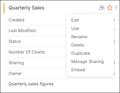
Options include the following:
-
Edit - Open dashboard in Design mode.
-
Use - Open a published dashboard in Interact mode.
-
Rename - Rename the dashboard.
-
Delete - Delete the dashboard.
-
Duplicate - Create a duplicate dashboard. A modal opens where you can manage the following assets when duplicating the dashboard:
- Charts - Duplicate charts without affecting the charts from the original dashboard (duplicate), or point to the original charts from the duplicate dashboard. Changes to the original charts are reflected in the duplicate dashboard.
- Filters - Duplicate filters (default).
- Actions - Duplicate actions (default).
-
Manage Sharing - Allows users with appropriate permissions to share dashboards with their organization, specific roles, or individual users. For more information, see Share Dashboards in Composer.
-
Embed - Create a copy-and-paste block of code for embedding a widget.
By default, a published dashboard card or row opens in Interact mode. Unpublished dashboards open in Design mode.
Design a Dashboard
Drag and drop charts and other items from the Canvas menu to design your dashboard. Use the following options to manage your workflow:
- Preview - View your dashboard from an end user perspective without committing changes to the server. In this view, you can interact with elements (such as filter controls or buttons) and execute configured actions.
- Discard Changes - Revert the dashboard to its state at the last publish.
- Publish - Apply changes to the server and update the dashboard. If users have created personalized versions, a modal prompts you to maintain or overwrite them. After publishing the dashboard, you can switch between Interact and Design mode.
- Unpublish - Remove a dashboard from interaction by all users. You can publish the dashboard again. At that time, you can either overwrite existing personalizations or replace them with the new published version.
Configuration Panel
The Configuration Panel provides options for a selected chart or canvas item to define the item's display on the dashboard, as well as chart actions.
Filters Panel
Use this panel to create filters with a dashboard or tab scope. Filters applied to a specific chart must be created from the chart.
Note: This feature is different from a Filter Control.
-
Select Add Filter in the chart's Filters side panel. The filter modal opens.
Alternatively, you can add a filter to the chart by selecting directly from the chart's filter icon.
-
Select a dataset column to filter.
-
Define the conditional filtering logic.
-
Select Apply to confirm and apply the filter.
After you create a filter, you can perform actions such as creating and managing additional filters and configuring the visual settings for the Filter panel.
Canvas Configuration Options
The following options are available. Select an item to apply specific settings.

Use the following File options to manipulate the dashboard and its general settings.
| Option | Description |
|---|---|
| New | Create and open a new dashboard while preserving the current dashboard. |
| Open | Open another dashboard. |
| Duplicate | Create a duplicate dashboard. A modal opens where you can manage the following assets when duplicating the dashboard: - Charts - Duplicate charts without affecting the charts from the original dashboard (duplicate), or point to the original charts from the duplicate dashboard. Changes to the original charts are reflected in the duplicate dashboard. - Filters - Duplicate filters (default). - Actions - Duplicate actions (default). |
| Theme Gallery | Selects a theme to apply to your dashboard. |
| Canvas Size | Adjust the pixel resolution of the dashboard. |
| Custom Dataset | Open the Create Dataset modal. |
| Download | Shortcut to the Export/Download feature. |
| Embed | Create a copy-and-paste block of code for embedding a widget. |
| Manage Sharing | Allows users with appropriate permissions to share dashboards with their organization, specific roles, or individual users. For more information, see Share Dashboards in Composer. |
| Delete | Delete the dashboard. |
Edit Options
Use common edit commands for selected dashboard items, such as Copy and Paste.
Grid Options
Use the following options to configure the grid displayed in the canvas:
| Option | Description |
|---|---|
| Snap to Grid | Enables or disables snap-to-grid functionality. |
| Show/Hide Grid | Toggles grid visibility. |
| Switch to Responsive/Fixed Grid | Toggles the grid type. |
Insert Options
Use the following options to create a chart or other items in the grid area.
- Canvas Menu - Inserts objects into the dashboard.
- Tabs - Inserts tabs into your dashboard. Use the configuration panel to set font, selector, background, border colors, and tab size. Rename, add +, or duplicate tabs from the three-dot menu.
- Header - Inserts a page header. Use the configuration panel to set background color, image, width, and height.
- Arrange - Sets the depth level and alignment of items on the grid. Select one or more dashboard items to enable this option.
Canvas Menu
Use the following options to manage the objects contained in the dashboard.
| Option | Description |
|---|---|
| Grid Options | Select a pixel resolution from the dropdown menu. Changing this setting can affect page size or reposition items, which cannot be reverted. |
| Undo and Redo | Undo and redo up to 50 actions. Standard keyboard shortcuts are also supported. |
| Create Chart | Create a new chart or insert an existing one. If inserting an existing chart, the chart gallery opens automatically. By default, the chart is inserted as a duplicate, allowing you to edit the chart without affecting the original. You can disable the duplicate feature at the bottom of the chart gallery. |
| Create Dataset | Opens a modal to create a new dataset from an existing one available within the application, configure its columns, and apply data pivoting (optional). A CSV based on the old dataset is generated and used as the connection source for the new dataset, which is immediately available for use. This feature enables tenant end users with no access to dataset creation to configure datasets for their dashboards. |
| Image | Insert a new image box. Use the configuration panel to upload using a URL or local machine and adjust the aspect ratio (Contain, Cover, or Fill). |
| Text | Insert a new textbox. Use the configuration panel to adjust text formatting. |
| Button | Insert a new button to navigate to another URL. Use the configuration panel to set its URL. |
| Container | Insert a new container, which groups and holds dashboard assets so they can be moved, deleted, copied, and pasted at the same time. Note: Only available in Fixed Grid dashboards. |
| Style Themes | Choose a custom theme. For more information, see Managing Themes. |
| Responsive View | Preview the dashboard on Desktop, Tablet, or Mobile, as well as customize breakpoints and the positioning of items on the dashboard. |
| Filter Control | Insert a filter control for end users. Options include Date Picker, Multi-select List, and Input Box. The configuration panel updates to display filter control options. |
| Align Objects | Align components with precision. Options include align left, center, right, top, middle, and bottom. |
| Arrange Objects | Arrange overlapping components with Send to Front and Send to Back. |
| Grid | Toggle Show Gridlines and Snap to Grid, or switch between Responsive Grid and Fixed Grid. |
| Download | Schedule exports and subscribe to them, provided the user's role has the necessary permissions. If multiple datasets are used, they are exported as separate files. For more information, see Download Manager. |
One-Click Application
After you have published one or more dashboards, you can open your application with a single click. The One-Click Application feature allows you to navigate through published dashboards and interact with them before embedding.
- Create and publish a dashboard.
- Select the link icon in the top-right corner.
The application opens in a new browser tab.
| Option | Description |
|---|---|
| Personalize View | Drag, drop, resize, and hide dashboard assets to create a customized dashboard. |
| Get Source Dashboard and Get Personalized Version | Toggle between your changes and defaults. |
| Undo and Redo | Navigate through the change history created during personalization. |
| Export | Export dashboard contents as CSV, PDF, or Excel. |
| Hidden Items | Browse and manage items removed during personalization. |
| Discard Changes | Revert all unsaved personalizations. |
| Save Changes | Confirm changes. |
| Hide Toolbar | Hide the toolbar containing these controls. |
Configure Actions
You can configure interactions on a chart by setting up Actions when users select a data point or chart panel in the End User and Preview pages.
-
Open the dashboard and select a chart panel.
-
Select Configuration, then select Actions to open a modal.
-
Complete the Actions modal.
a. Select an action from the dropdown:
b. Add configuration settings for the action as needed.
c. Each action works without parameters. In the Action Parameters section, select Add Parameter to pass additional data from the selected data point to the action target.
Note: This step does not apply to Chart Drill Down actions.
d. Define the parameter.
- Column - The dataset column that supplies the parameter value.
- Value - A data token or a static value. When a column is selected or changed, the value is automatically filled with the column's data token. The value must match the column's data type. For aggregates, the value passed is the first record found for the column within the chart's category.
- Name - The parameter name. This field is only available for Go to URL actions. For all other action types, select a column.
Select the add icon (+) to add another parameter (up to 10). Select the remove icon (-) to delete a parameter.
e. To add another action, repeat these steps. You can configure multiple actions for each action type for charts and tables. The following configuration limits apply:
-
Charts (general) - Up to 20 total actions for each chart. Not every action is available for every chart type.
-
Tables (Simple, Grouped, Expandable):
- Go to URL - One action for each table column.
- Other action types - Up to 20 total actions for each table.
-
Select X to save the actions and close the modal.
If only one action is configured, it occurs immediately. If multiple actions have been configured, a tooltip menu displays a list of options for the user.
Apply Filter
The Apply Filter action enables users to filter data by selecting a data point. For example, you can select one of the following categories to filter the chart according to the chosen value.
-
Filter Scope - Select the scope of the filter:
- Chart (default)
- Full Dashboard (filter all charts on the same dashboard)
- Current Tab (if dashboard contains tabs)
-
Menu Command - Name displayed to users in the menu options.
Action parameters are optional for this action. Without them, the Apply Filter action creates a filter from the value of the selected data point. When a parameter is passed, it is also used as a filter.

Apply Filter in Tables
The Apply Filter action is supported for simple and grouped table charts. When this action is defined for a grouped table, users can select any cell value, and the table automatically applies filters for all categorical values located to the left of the column where the selection occurred.
For example, selecting the cell with the value "Health and Beauty" in the Product Line column filters the table to include that value along with all its parent values from the grouping hierarchy. These filter criteria are added automatically, and the applied filters are visible in a filter panel when enabled on the dashboard. The same behavior applies when selecting a cell in the Total column. If a user selects a value in the first column, only that specific value is added to the filters.

Go to URL
Enables users to navigate to a valid URL when selecting a chart.
- URL - Target URL, properly formatted.
- Open In - Where the webpage opens: Self (current page), New Tab, or New Window.
- Menu Command - Name displayed to users in the menu options.
Notes:
- You can use data tokens as part of the URL.
- In a Table Chart, you can select multiple columns for a target URL.
When a parameter is passed in this action, it is appended to the query string parameters.
Go to URL in Maps
The Go to URL action functions similarly in Dot Maps and Bubble Maps. As a creator, you can configure a Go to URL action to redirect users to a specified URL when they select a data point.

Multi-Level Behavior
You can also define multi-level behavior where the action constructs a hierarchical navigation through the context menu based on dataset columns.

To set up multi-level behavior, configure the following fields:
- Levels - Specifies the data for each level. Only geolocation columns are allowed. Up to five levels can be defined, with each level requiring a unique column.
- # Records per Level - Determines how many records are displayed per level, based on the sort method.
- Sort Records - Sets the sort order for records at each level, either Ascending (default) or Descending.
Action Execution
- If Go to URL is the only defined action, users are redirected to the target dashboard immediately when selecting a data point.
- If multiple actions are defined, a context menu displays labels specified by the creator. Users can then select the needed action.

Multi-Level Navigation
The Go to URL action includes a Multi-Level setting for geographical hierarchies (for example, State, City, Zip Code). When enabled, users navigate through a hierarchical contextual menu. Selecting each level reveals the next, until the final level is reached, where users are redirected to the specified URL.
Chart Drill Down
Drills into a subset of the data in the chart.
- Modes:
- Off - Disables this action.
- Default - Drill down on data while the chart remains the same. Select the fields and columns available for users to choose from.
- Custom - Drill down into data with configurable levels that dynamically update the chart based on the user selection.
- Options:
- Default > Select Columns to Display - Add or remove columns as needed.
- Custom > Layer(s) - Add or remove columns to serve as drill-down layers.
Chart Drill Down in Tables
- Simple Tables - To drill down to the next level, select a column value.
- Grouped Tables - To drill down to the next level:
- Select a value in the columns - Uses the values of all groups in the row.
- Select a Group - Uses the values of the group and its parent groups.
Go to Dashboard
- Select Dashboard - Select a dashboard from the dropdown.
- Menu Command - Users see this name as a menu option.
Select Add Action Parameters to define a parameter. When a parameter is passed in this action, it is used as a filter.
See Data
Opens a modal displaying the data behind the chart.
- Menu Command - Users see this name as a menu option.
When a parameter is passed in this action, it is used as a filter.
Custom Datasets in Dashboards
Select Custom Dataset in the Dashboards module to display an options menu where you can create a new dataset or view existing custom datasets.
The View Custom Dataset option displays a table with the following columns:
- Name
- Source Dataset
- Records
- Columns
- Last Load
- Data Sync
The options menu for each custom dataset includes choices to turn sync on or off and delete the dataset.
Custom datasets sync with their source dataset at least every 12 hours. You cannot edit them in the Dataset Design tab.