Tooltips
By default, tooltips display the data used to generate each point. For example, if a bar chart value is 100, the tooltip displays 100.
Most Qrvey charts support custom tooltips. You can customize tooltips by adding columns that map to other fields in the dataset.
To enable tooltips:
-
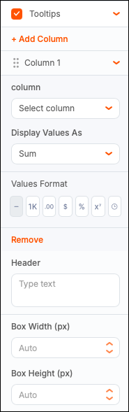
From the General panel in Chart Builder, select the Tooltips checkbox, and then select the chevron to expand the section.
-
Select Add Column to map a dataset field to the tooltip.
-
Select a column name from the dropdown.
-
Select an aggregation from Display Values As.
Supported functions depend on the column type and include Sum, Average, Median, Count, Distinct Count, Minimum, Maximum, and Unique.
-
Configure the Values Format:
- Default – Shows the full value (for example, 1,234,567.89).
- Abbreviated – Shortens values to K (thousand), M (million), and B (billion) (for example, 1.24M).
- Decimal – Controls decimal display (for example, 1,234,567.9 for 1 decimal place).
- Currency – Displays as currency (for example, $1,234,567.89).
- Percentage – Displays as a percentage (for example, 1,234,568%).
- Scientific – Uses exponential notation (for example, 1e+6).
- Duration - Displays intervals in different formats (for example, day, hour, month, and so on).
-
(Optional) Set a tooltip header by entering text in the Header field. You can use system tokens to add customization. Type
{{in the Header input to display available tokens. -
(Optional) Define the tooltip box width and height in pixels (default is auto). If the tooltip text does not fit in the box, the system wraps or truncates the text as needed.
-
Select Save Chart to view the updated tooltip.
You can add multiple custom tooltip columns.
Note: Custom headers and columns are not supported for all chart types.