Table
Tables display data in rows of adjacent columns. This visualization allows viewers to perform analytical functions such as grouping, sorting, and filtering. Tables are best suited for viewing the raw data in a dataset or for analyzing multiple aggregations of data grouped by one or more categories. Tables support the display of an unlimited number of columns and rows, allowing users to view the raw unaggregated data before performing additional analysis.

Create a Table
You can create a table using one of the following techniques:
- Drag and drop fields from the Data panel onto the Columns shelf.
- Drag and drop fields into the top table guideline with the label Drop column as column after pausing the cursor over the table.
An end user can review which fields from the Data panel are part of the table at the top of the window in the columns (Group shelf).


You can sort data in each column in ascending or descending order, remove the sorting, or remove the column from the table, using the options (three-dot) menu of the column pill. Use the drag handle on the left side of the column pill to change its position or remove it from the table. You can also perform these actions in the canvas.
Table charts support multi-column sorting in Design and Interact mode. For more information, see Sorting.
The header of each column defaults to the name of the data column that is selected for that column. You can change the text using the Edit option from the options (three-dot) menu on the table column header.

Grouped Tables
You can create this type of table by dragging and dropping columns from the Data panel onto the Columns and Groups shelves. In this scenario, the table treats fields in the Groups shelf as a group, while the fields in the Columns shelf are aggregated within the selected groups.

You can also create a grouped table by pausing the cursor over the chart and using the vertical and horizontal guidelines that display.

Style the Table
In the Configuration Panel on the right of the Chart Builder, you can style different aspects of your chart.
General
The General panel is available for all chart types, and the options vary depending on the chart selected.
| Option | Description |
|---|---|
| Self-service Options | Add self-service options for your end users. For more information, see Self-service Options. |
| Totals | Display the total and subtotal of selected values in the last row of the table or the group. For more information, see Totals. |
| Table Calculations | Add a calculation to your table. For more information, see Table Calculations. |
| Aggregated Formulas | When you group the table, the panel displays an option to add an aggregated table formula to your data. |
| Allow Pagination | In ungrouped tables, you can distribute data across pages by selecting the pagination option. You can set the number of records for each single page in Records per page (the limit is 1,000). This option displays information about total records in the table, the number of records per page, and the current page in relation to the page set.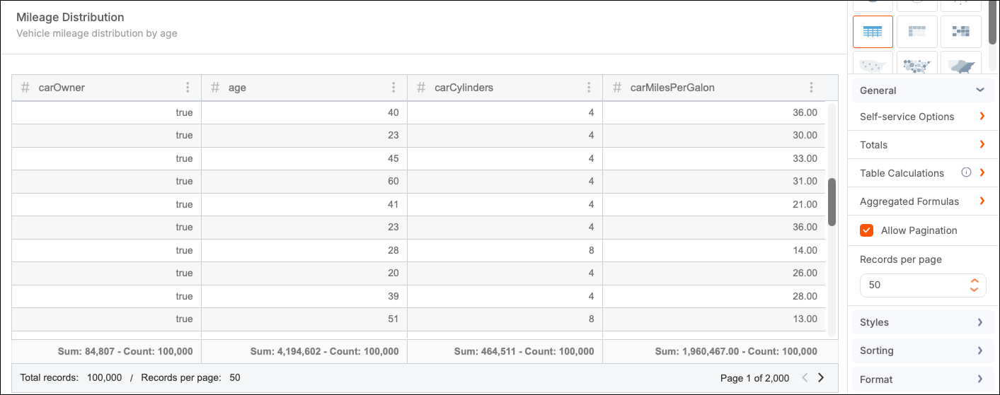 |
| Max Groups | This option is available for grouped tables (when you add at least one column to the Groups shelf). It is set to 50 by default (limit 10,000). |
Self-service Options
This panel provides several options that enable end users to personalize their tables. Customizations made in a dashboard are saved for the end user. In embedded scenarios, the clientId must be provided to save the personalizations.
| Option | Description |
|---|---|
| Filtering | Enables the Filtering option for end users to add filters to the chart. For more information, see Filters. |
| Column Resizing | Enables end users to change the width of columns inside the table. |
| Column Arrangement | Enables end users to drag-and-drop columns to change their order inside the table. |
| Visualization Options | Enables end users to select whether to display the values inside each column as values or bars. |
| Sorting | Enables the Sorting option for end users to apply sorting to the table. The Sorting option supports both multi-column and individual column sorting. For more information, see Sorting. |
| Add/Remove Columns | Enables end users to select which columns to hide or display. |
| Add/Remove Groups | Enables end users to add or remove groups in a grouped table. |
| Change Column Aggregations | Enables end users to change the aggregation used inside columns. Only applies to columns inside a grouped table. |
| Comparative Analysis | Enables end users to set up comparative analysis in a grouped table. |
| Download | Enables end users to download the chart or its data in different file formats. By default, all formats are selected. |
| Reset Columns Width | Reset all columns to original width after a column has been resized. |
Totals
Use this panel to define the total and subtotal of chosen values displayed in the last row of the table or the group.

| Option | Description |
|---|---|
| Columns | Select the columns to act on. All columns are selected by default, but you can remove them as needed. |
| Total | Select the type of aggregation to display (Select All, Average, Median, Count, Distinct Count, Minimum, Maximum). |
| Level | Determines where the aggregation is applied (table level or group level). This feature is enabled if you have groups present. |
Comparative Analysis
Use comparative analysis to compare aggregated values in a grouped table chart across different date periods.
Comparative analysis supports the following modes:
- Distinct view — Selected by default for new charts and existing charts without a prior comparison configured. This comparison experience displays reference, comparison, and difference values in separate columns.
- All-in-one view — Selected by default for existing charts that already have a comparison configured. This legacy comparison experience preserves the previously configured date column, time period, comparison criteria, and other settings.
For more information, see Comparative Analysis.
Styles
Use the Styles panel to control visual elements such as colors and labels. This chart type supports the following specific options.
-
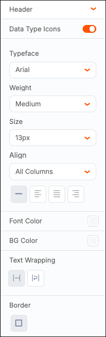
Header - Manage header features such as font, weight, size, and color of the text, cell color and borders. You can also control the display of data type icons within the header and text wrapping within the header row.
-
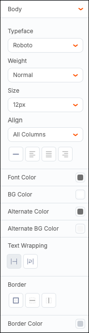
Body - Manage the font, weight, size, and color of the text, as well as cell color and borders for the rest of the cells in your table. You can also select alternating colors of the foreground and background of the table rows, enable text wrapping, change the type of border, and modify its color.
-
Resize Rows - Set a height for your rows.
-
Offset - By default, the system centers the chart within the layout (Auto). To create a manual offset, select Percentage or Pixels, then add numbers to the Left and Top fields.
Sorting
Use the Sorting panel to control sorting options for ungrouped and grouped tables.
Sort Simple Tables
Simple (ungrouped) tables can be sorted in the following ways:
-
Single Sorting: Sort one column at a time (default for simple tables). Each table column contains a sorting icon. To sort the column, select the icon to sort the column’s values in ascending order. Select it again to sort the values in descending order.

Sorting another column removes the previously applied sort. The table keeps the last column sorted.

-
Multi-Column Sorting: Sort multiple columns simultaneously. The multi-column sort option is located in the options (three-dot) menu of each column header. A multi-column sort option is displayed at the top left of the table. To sort by multiple columns at the same time, select them from the dropdown list. All sorted columns are displayed at the bottom where you can select an individual ascending or descending sort order using the buttons, or you can remove the column’s sort by selecting the X icon.
When the multi-sort column option is active, you can also select the sort icon for each column’s header. The multi-column option above the table syncs with the action you take on the table column’s header.
Sort Grouped Tables
You can simultaneously sort any number of grouped columns, applied from left to right. The following points apply to the sorting of grouped table charts:
-
When the table chart has one grouped column, all the other columns are aggregated. You can sort the grouped column or one of the aggregated columns, but not both.
-
When more than one column is grouped, the same logic applies to the last (innermost) group and the aggregated columns that follow.
-
When more than one column is grouped, each group is sorted inside of the group immediately above it. For example, if the data is grouped by “Product Vendor” and “Product Line”, sorting of product lines happens inside of their respective product vendors and not in the entire dataset. That means that even though you can sort multiple grouped columns, you cannot change the order in which they are sorted unless you physically move the grouped columns in the table. In the “Product Vendor” and “Product Line” example, to first group by “Product Line” and then by “Product Vendor”, you must move the grouped “Product Line” column before the grouped “Product Vendor” column.


Format
You can apply conditional formatting to your table charts.
-
Select +Add Condition.
-
Select color options:
- Color of the text.
- Color of the cell to show when your condition is met.
- Outline for the cell or highlight it in the chosen color.
-
Select a column, then set the operator and decide if the condition applies to a specific column or the entire row.
Select Remove to remove the conditional formatting.

The following example highlights all orders where the quantity is 1,000 units or more.

In ungrouped tables, you can include a column that hasn’t been included in the table. In the dropdown menu, you can see Chart Columns and Other Columns.

Trend Chart
The Trend Chart panel only displays in grouped tables. Use this panel to set up a column or bar chart for each aggregated value over the values of another “Trend By” column, usually a date that can be grouped into months, quarters, years, or other units.
For more information, see Trend Chart.
Filters
You can add filters to your table by expanding the Filters panel in the configuration panel or by selecting Filters from the toolbar.
Filters that are created in the Chart Builder are hidden from end users. You cannot edit or interact with these filters in view mode.
For more information, see Chart Filters.
Resize Columns
You can manually modify the column sizes of table charts by selecting the border of the column header and dragging the line to the left or right.

Reset Columns Width
After you resize a column, select the Reset columns width icon in the chart header to restore all columns to their default width. This option is available in simple, grouped, and expandable tables.

To make this icon available to end users, enable the option in the Self-service Options panel.
Reorder Columns
Table creators and end users can organize columns using actions similar to Excel spreadsheets and Qrvey's Tabular View.
Simple Table
Creators can reorder columns in the following ways:
-
Directly from the table headers. Columns in simple tables can be reordered by selecting a header, “grabbing” it to slide the column to the left or right and then “dropping” it in the desired place. This method works both inside Chart Builder and in Page or Report Builder, when the table has been saved. After dropping the column in its new place, the column pills in the shelf inside Chart Builder appear in that same new order.

-
From the Columns shelf. Columns can also be reordered in the analytic panel by dragging and dropping the column pills in the desired position in the shelf. This method only applies to the edit mode of charts and can be performed inside Chart Builder.

Grouped Table
Grouped tables use the following types of columns:
- Aggregate - Columns placed in the Columns shelf, whose values are aggregated.
- Grouped - Columns placed in the Group shelf, which define how aggregate columns are grouped.
Aggregate columns can be reordered like a simple table:
-
Directly in table headers by selecting a header, “grabbing” it to slide the column to the left or right and then “dropping” it in the desired place - either in edit mode (in Chart Builder) or after saving (in Page or Report Builder).
After dropping the column in its new place, the column pills in the shelf appear in that same new order.


Note: Aggregate columns cannot be dragged between or before the grouped columns.
-
Columns can also be reordered in the analytic panel by dragging and dropping the column pills in the desired position in the Columns shelf. This method only applies to the edit mode of charts and can be performed inside Chart Builder.

Grouped columns can only be ordered in Design mode, such as inside Chart Builder, and only from the columns shelf. For this reason, they cannot be reordered by end users, who only work with the saved chart.
Add Images to a Column

To add an image to a column within a simple or grouped table:
-
Open the Chart Editor of the desired table.
-
Select the desired column's header (or the column's section pill) to open the Column Settings menu.
-
Select Add Image.
-
Configure as desired:
- Image Field — Select a column in the dataset that contains the image URLs.
- Size — Select Small, Medium, Large, or Custom.
- Display — Positions the image relative to the column's values: Left, Right, or Image Only.
Aggregated Formulas
Formulas apply to the values of one row of data. Their results are presented as new columns for the same row. Standard formulas apply to raw data, while aggregated formulas apply to data that has been grouped and aggregated for a chart. The aggregated formula function is only available in grouped table charts.
The action panel displays “Aggregated formulas” when the table is grouped.
Aggregated formulas are created using the same UI and syntax as regular formulas. However, Aggregated Formulas only apply to data that has been aggregated by the selected groups for the table, and are limited to numeric functions and aggregated columns in the table chart.
To create calculations across columns on the aggregated values while creating or editing a grouped table (a table that has at least one column in the Group shelf):
-
Select + Add Aggregated Formula to open the Create Table Formula modal.

-
Enter a formula name.
-
Add a formula using the available options. You can use any columns of the current context to construct the formula.
-
Select Test to test the formula.
-
Save your changes.
The new aggregated formula can be edited or removed by selecting the Aggregated formulas action item.
